
 Feb 19, 2018
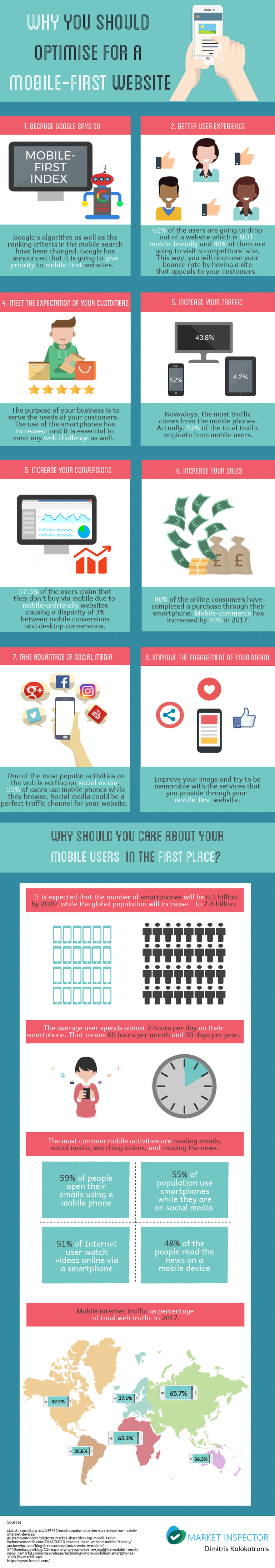
In the past, mobile phones were used only for basic searches, mainly due to slow processing speeds on phones. Today, the technology has vastly improved, and more people than ever are using their phones for all kinds of searches and transactions. In connection with this, Google announced that they are going to primarily consider the mobile versions of sites to determine rankings, meaning mobile-first websites are now a priority.
From Mobile-Friendly to Mobile-First Websites
Due to technological progress with mobile devices, the use of phones increased, and in 2015 Google changed its algorithm to emphasize the importance of mobile-friendly sites.
In order to handle this change, some businesses built AMPs (accelerated mobile pages). That means that this page was a copy of the original one, but on a smaller scale. Essentially, AMPs are a lighter HTML version of the desktop site. The focus with AMPs is speed and readability, so features like drop-down navigation are limited.
On the other hand, some businesses adopted responsive web design. Responsive design ensures that a website responds to the user’s screen. As a result, the layout changes, unnecessary images are hidden and the website provides the most valuable information to the user.
And now Google has released a new update again, stating that priority will be given to sites that have adopted a mobile-first design. As the majority of online web traffic now stems from smartphones, it is logical that Google updates its algorithm in accordance with users’ behaviour and needs.
In fact, mobile visits now make up 52.6% of the total web traffic, and forecasts are predicting that the number of mobile users will reach 6.1 billion by 2020. Therefore, having a mobile-friendly or responsive design is not sufficient, but rather a mobile-first design is needed to rank high in search engines.
How do you use your mobile-phone? Which is the most common activity? According with studies, the most common activity is checking emails. To be more precise, 59% of people open their email through their mobile-phones. Furthermore, 56% of people, globally, are navigating on social media via smartphones. The third most common activity is video streaming. 51% of Internet users use their mobile phone to watch a video.
Should I Hire A Web Design Agency?
Nevertheless, most companies have the following hesitation: Should I delegate my site’s web design to a web design agency or should I learn how to do it myself? Of course, there are pros and cons for both possibilities.
Hiring a company to construct and design your website can be costly, but you will save a lot of time. So, you have to think about the total opportunity cost instead of focusing on the one-time payment only. Of course, web design prices differ from agency to agency. Apart from this, you have to take into consideration the result. It is reasonable to expect that if a professional takes over your site’s web design, the results will be that much better.
On the other hand, trying to do it in-house demands time and perseverance. You have to ensure your team’s design skills are up to par. The advantage is that you could save some money, but remembering the opportunity cost. Eventually, the end result will all depend on your skills.
Web Design Trends for 2018
Even though mobile-first is one of the most important trends, there are also some other trends that can boost your site in the rankings, as well as improve user experience.
1. Irregular Grid Layout
Irregular grid layout is the new easy way to combine all the elements of a website. The navigation of your site will be much easier for the user. Using JavaScript and CSS you can have a stylish and at the same time an easy to use website. Pinterest has been using it since 2010.
2. Make Your Fonts Stand Out.
Try to use a font style that is distinct and also easy on the eye. Try to find colours that agree with your brand guidelines. Of course, colours should match and complement one another in order to appeal to the users. Try to use bold fonts in order to emphasize the most important info of your website. In this way it’s easier for the user to read your content.
3. Use Artificial Intelligence.
Improve the effectiveness of your site by using Artificial Intelligence (AI). Businesses have already started to use (AI) on a small scale. For instance, you can use chatbots to serve you customers very fast and provide them with good quality of service You will ultimately improving the user experience by providing information on-demand.
4. Use Particle Motion Background.
Sometimes, using pictures as a background might not feel enough for what your business is trying to achieve on your website A popular trend right now is to use particle motion background, which can give your site a modern decorative element. You can even make it interactive and responsive to where the mouse hovers for added animation.
It is up to you which trends you would like to follow, and trends will vary from industry to industry as well. However, mobile-first web design is critical for any business to help rank on search engines, so this should be a priority. Most users navigate the Internet via smartphones, so as a business you should adapt to your customer’s behaviours.
In the following infographic by Market Inspector, you will find the most crucial reasons why you should have a mobile-first website.


 Contact us