Oct 29, 2020
Continuing our Halloween build up, we have a list of some of the scariest website designs ever.
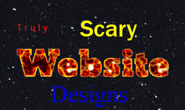
Whether due to satire, over use of crazy flame text or just due to a misjudgement of style at the time, these are some of the scariest websites on the internet.
Obviously we mean no harm to any of these websites – Some are simply just a trip down memory lane, they have been mentioned in numerous bad lists before and haven’t changed their designs – Something must be working right for them!
1. The worlds worst website ever
Everything from the early days of the web all in one place. Flashing text, animated break lines and bevelled photos, this website is sure to drag you back to the early days of website design – And bring back some bad memories.
2. Craigslist
Often associated with some pretty unsavoury things, the design of this website leaves a bit of a sicky feeling in your mouth. Strong blue hyperlinks and a weird mosaic style miss match of tables, it really does hurt the eyes and make you really work to find what you are looking for. This design was apparently created in 1995 and hasn’t been changed since – it did have it’s peak, especially in the USA and is apparently valued by Forbes at around $3 Billion!
3. Yahoo Circa 1998
Looking back there is no doubt about it that at one-point Yahoo! Ruled the web. And then along game Google. The thing we don’t like about this website looking back was just how everything was in your face as soon as you landed on the website. It used a small font size, those overwhelming blue links and just sat, almost embarrassed, all squashed up in the centre of the page. It was great at the time, but looking back…?


 Contact us