
 Sep 30, 2019
Some thirty years ago a person named Tim Berners Lee developed the web, purely so that people around the world could share information.
At that point in time, he could never have imagined in his wildest dreams how the World Wide Web would become a major part of everyday life.
Whether you use the web or not, you cannot ignore it. Since the 1990s, it has grown enormously and is now something of a behemoth.
No matter which way you look at it, it is now ingrained deeply in our social fabric.
But the web no longer looks the same as it did back then.
Just as the design of other products has changed through the years, so has the web. In fact, the way that web design has changed does seem to echo the technology and fashions of the time.
But whereas cars, houses and phones have transformed slowly, the web has changed its shape with lightning speed.
If you think back to the first websites, they were purely text with hyperlinks detailing what the web was and how it could be used. From then until now, web design trends have changed dramatically.
Early 1990s
Cast your mind back to this period and you may recall the very first language used by the web. This was HTML – Hypertext Markup Language. Providing pages of pure text, it was extremely limited with little if no graphics.
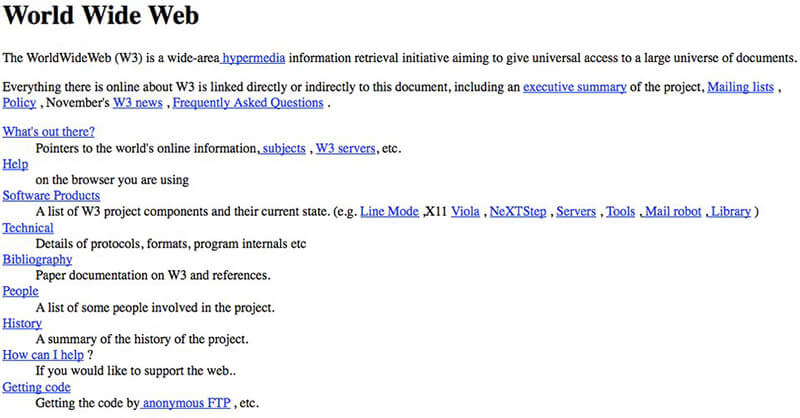
Image courtesy of and you can see the first ever website here: http://info.cern.ch/hypertext/WWW/TheProject.html
The only way to negotiate the pages was to scroll down vertically or follow the hypertext.
After this followed GUI – Graphical User Interface. Now designers could incorporate images, making websites look far more visually interesting. As the web became more and more popular, web designers added not only tables to the text but tables too.
The use of tables enabled page layout structures on the web to be much more akin to traditional printed documents.
Designers could now arrange both text and graphics but there was one problem; the code used to build them was far more intricate than processes that would be adapted in the future.
Late 1990s
Now something dazzling arrived on the scene of website trends known as Flash and it completely turned web design on its head. This software platform now allowed web designers to make websites all singing and dancing, adding in music, video and even animation.
This was their first taste of being able to build websites that delivered a powerful audio-visual experience.
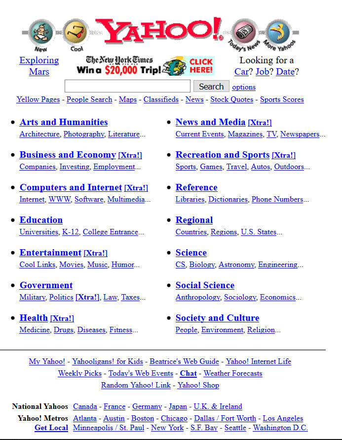
Image copyright Yahoo! and taken from the way back machine
Sites could also be far more interactive with menus, splash pages and bubble buttons. The result? People loved it. Not only were these designs upbeat but they also lured viewers in to get more involved, clicking onto what looked like real ‘buttons’.
But sadly (or happily!), Flash was not around for long. If viewers did not have an up-to-date version of the Flash plugin installed on their computer, the site would not run. This was a big negative as far as the accessibility of Flash websites was concerned.
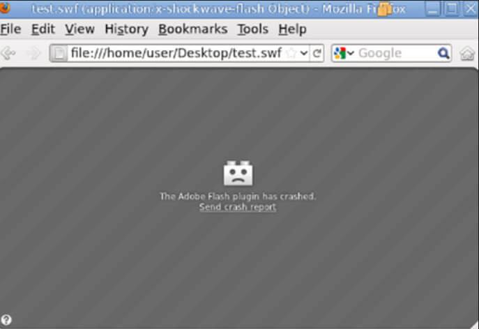
Image Courtesy of Adobe
But although Flash had its problems, it did change the way that websites operated. Website users became far more sophisticated when it came to browsing.
Design elements could be incorporated without worrying about educating users as to their functionality. The blue underlined hyperlinks could be relegated into the box labelled ‘things of the past’.
Then there was a massive sea change with the emergence of social media. More flexibility was required to enable user interaction and this was when CSS came onto the scene – Cascading Style Sheets.
CSS allowed the use of larger fonts to obtain greater impact.
These could be spread across multiple pages without the website creator having to code each page separately, the idea being that they would use CSS for presentation and HTML for content.
Website trends now saw the boom of web design templates. Sites popped up that providing a range of website designs for general use, allowing anyone to build their own site. The problem was, many of the sites that resulted were not good to look at or very easy to navigate.
Enter 2010
A new kid on the block and this was something called responsive web design.
It still made use of HTML and CSS but it enabled the site to react to different display environments.
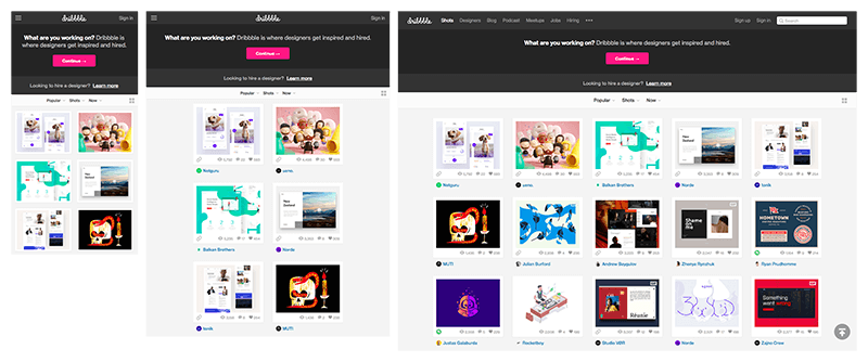
Image courtesy of InvisionApp & Dribble
For example, a site would look the same whether viewed on a tablet, phone or desktop. Display problems were eradicated and overall website efficiency was boosted.
With so many people viewing sites on mobiles, responsive design became the way to go.
This led to a new trend in web creation called flat design which encompassed a two-dimensional style, valuing functionality over fussy design features.
2019
Flat design is still very much in vogue. You could say that website trends have gone full circle, prioritising ease of communication of information. Design complexity has reduced and buttons have had their day.

By looking at web design through time, we can see that a lot has happened in a short period. Whereas technology used to drive change, now design is not hinged upon the use of technology. Experienced web designers today can create virtually any type of website they wish to within the web.
Think of it this way; web design today is no longer limited by what is technically possible but by what designers can build. If you are having a website built at the present moment you will notice that during discussions, the focus is on the people that will use the site, providing them with a winning experience.
If they are your customers, this is paramount to business success.
Website design today is based upon desire driven by organic growth instead of that provided by technology.
2020 Web design trends
As we find ourselves heading towards 2020 the question is, what are 2020 web design trends going to bring us? Look out for very large oversized lettering, layouts that are asymmetrical, 3D design, use of animation, custom images, split content, screen-sized forms and hidden navigation.
Of course, voice user interface is going to be very big too in the field of website trends.
But as for the rest – time will tell.


 Contact us